


.avif)


.avif)


Crafting the concept: analog soul meets digital mind
The concept for Sculpt emerged from a simple idea: although Clay (the company) builds digital tools, its spirit is deeply analog. We wanted the event to feel like the meeting point of these two worlds.
The name Sculpt became our metaphor – a space where people shape ideas in real time, much like potters shaping clay. We envisioned the conference as a “communal kiln” where the process of creation is just as important as the final product. This meant embracing an ethos of hands-on making, experimentation, and a touch of messiness. Rather than a polished, rigid corporate event, Sculpt would be about process as much as product: it’s hands-on, messy, iterative, and full of unexpected breakthroughs. A celebration of imperfection and the craft of making something real.
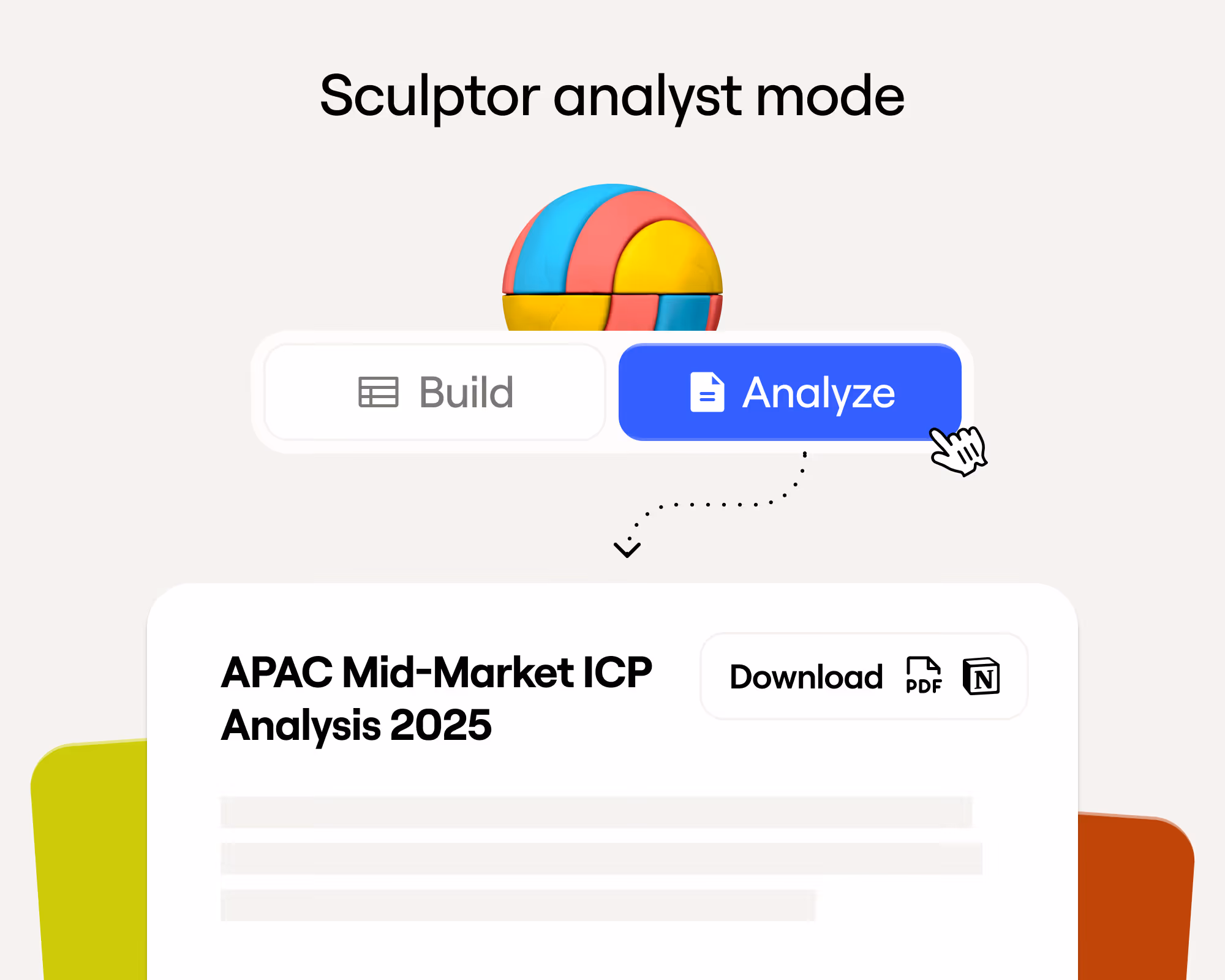
We wanted to break the passive conference mold. Sculpt was designed to be interactive and involved, where attendees wouldn’t just sit and listen to slide decks, they would actively participate. The official announcement communicated this precedent: “You won’t be sitting silently in a crowd… You’ll build AI workflows… and get your hands on new features”.
This mandate for interactivity flowed directly from our analog-meets-digital concept. Just as working with clay requires tactility and involvement, so would our conference. We set out to create an environment where every guest felt like a co-creator rather than an observer.
Bringing Clay’s aesthetic to life
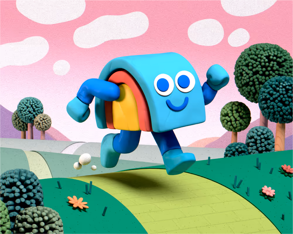
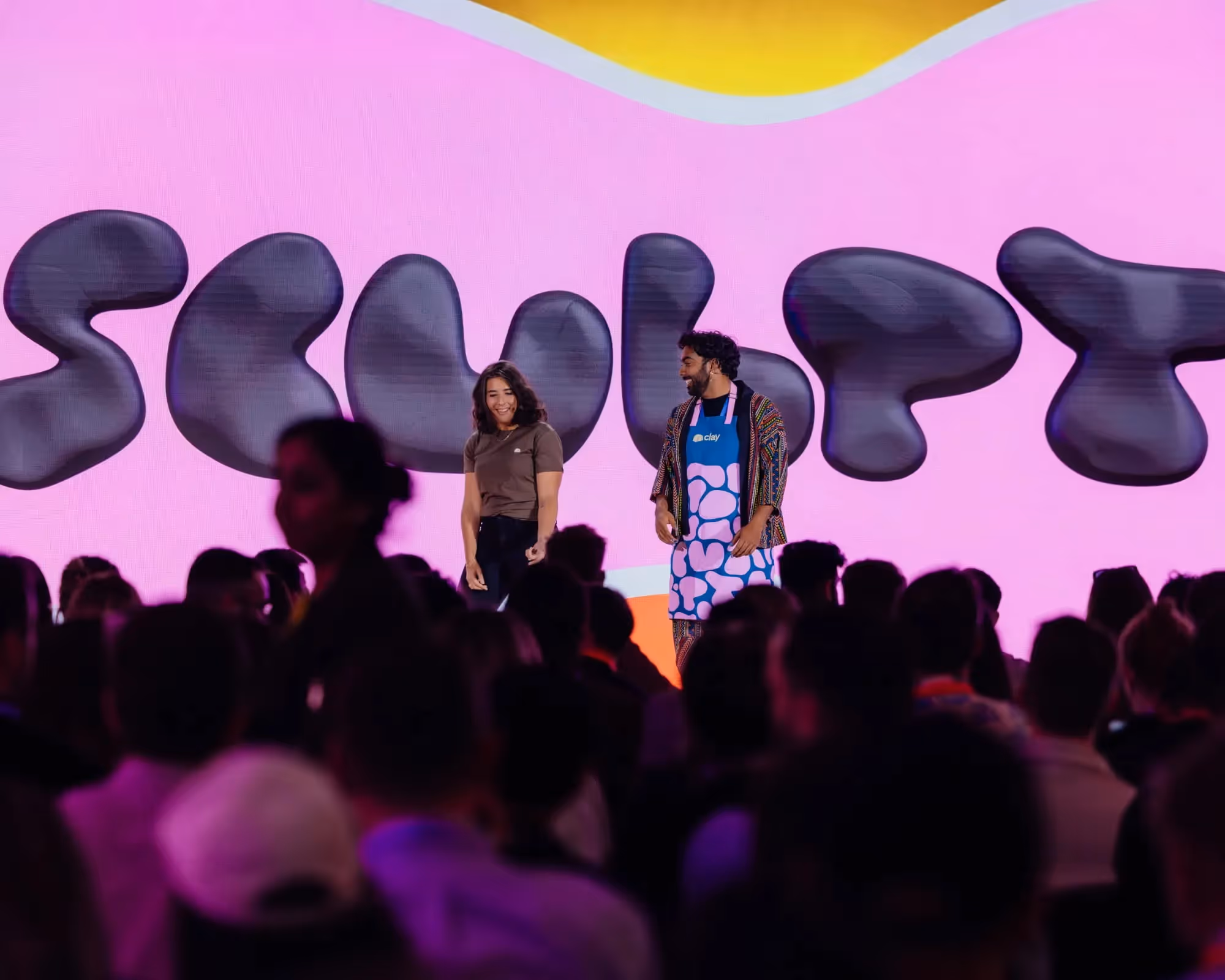
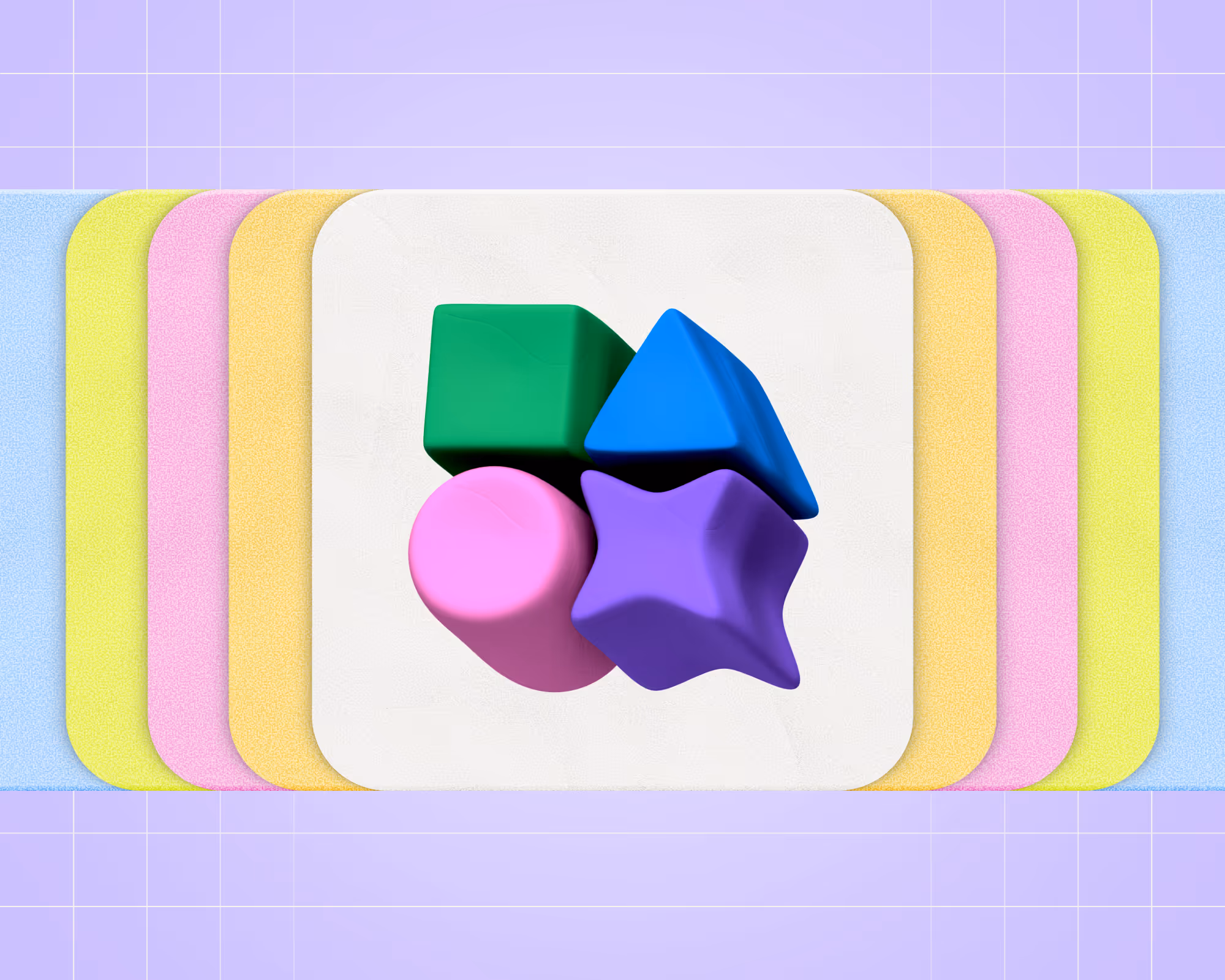
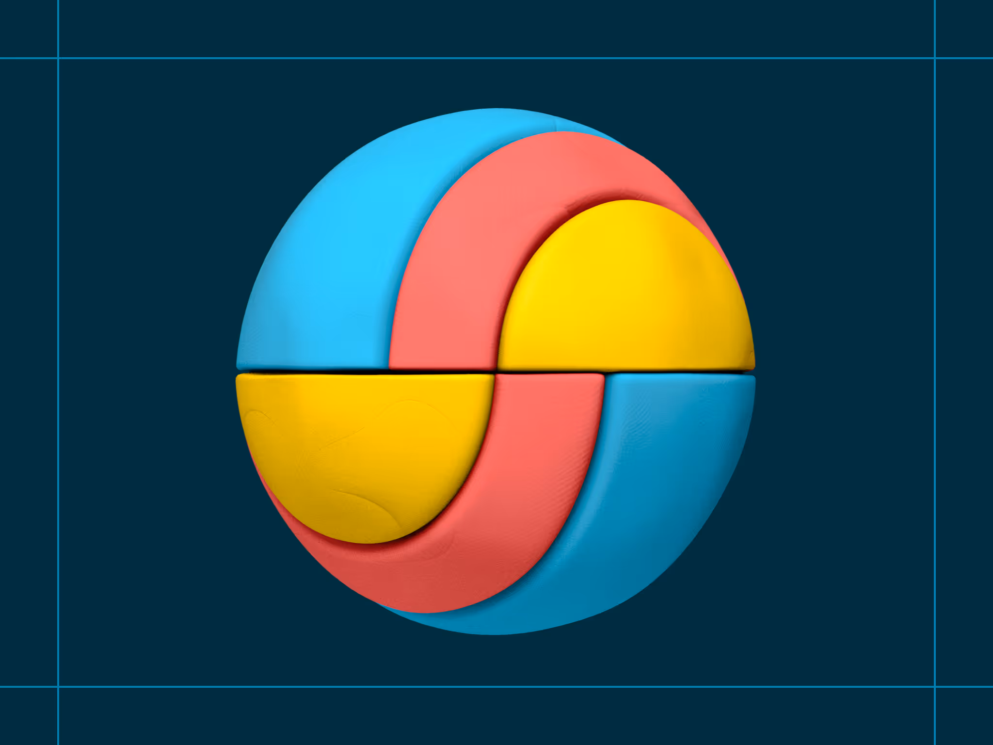
To communicate the analog spirit, we turned to clay, the material, as our primary design language. The visual identity of Sculpt was tactile, earthy, and full of character.
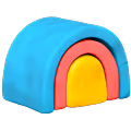
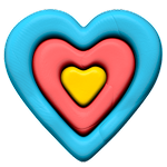
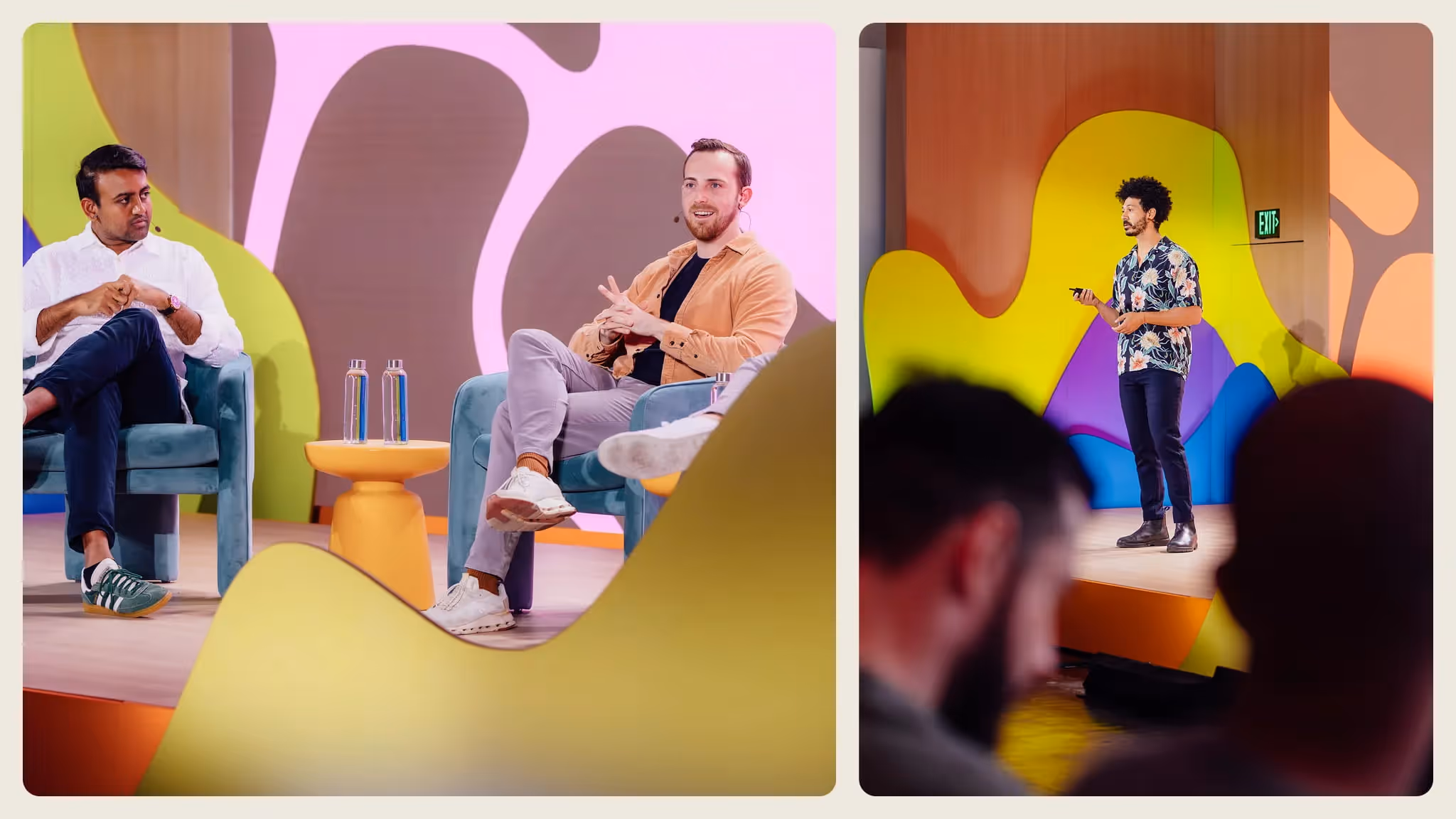
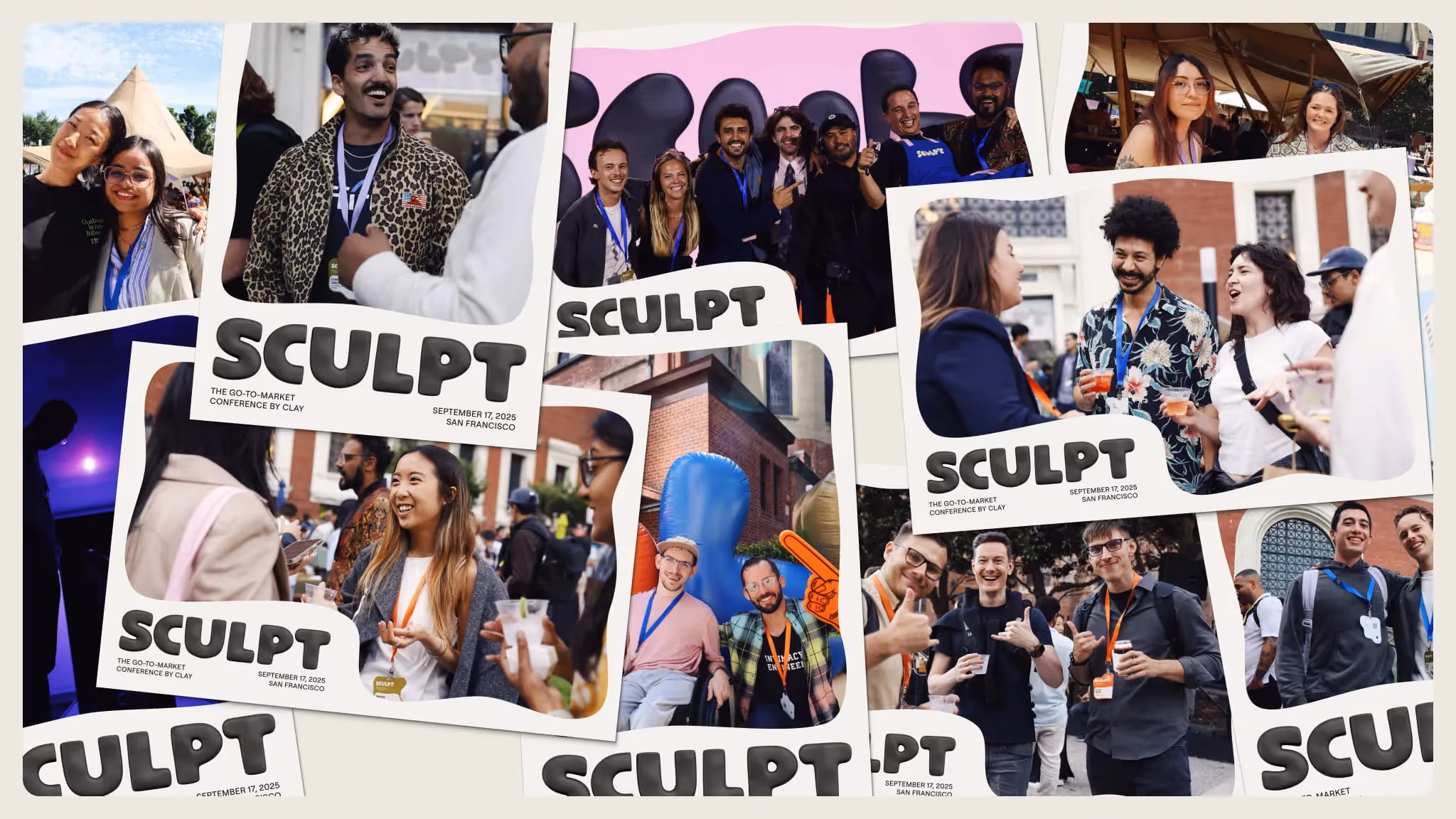
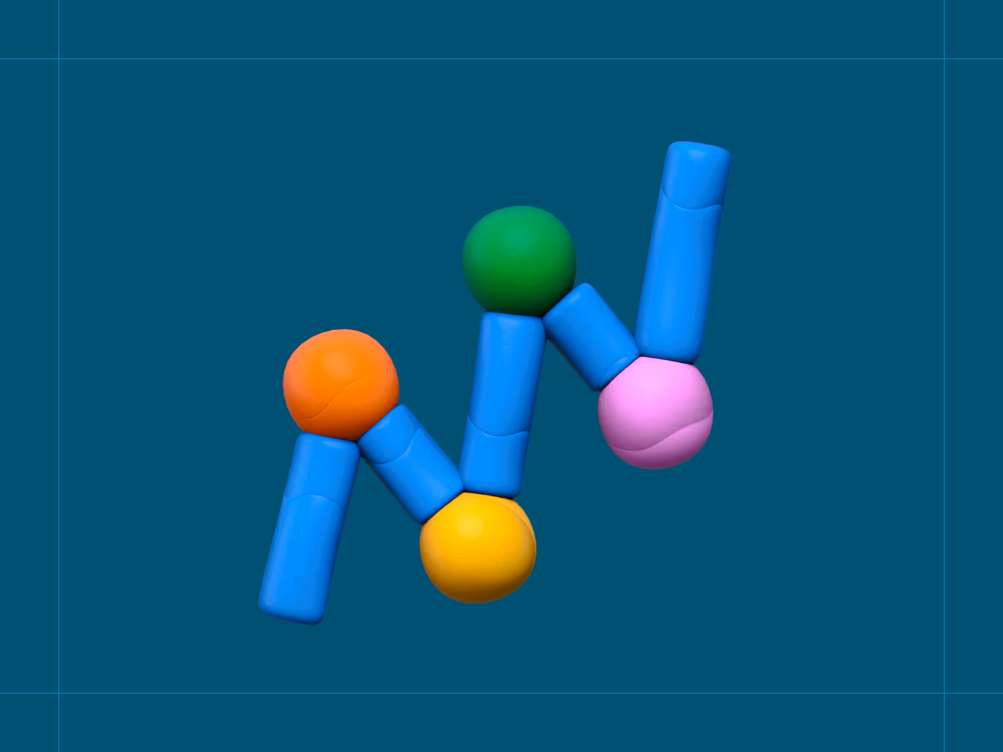
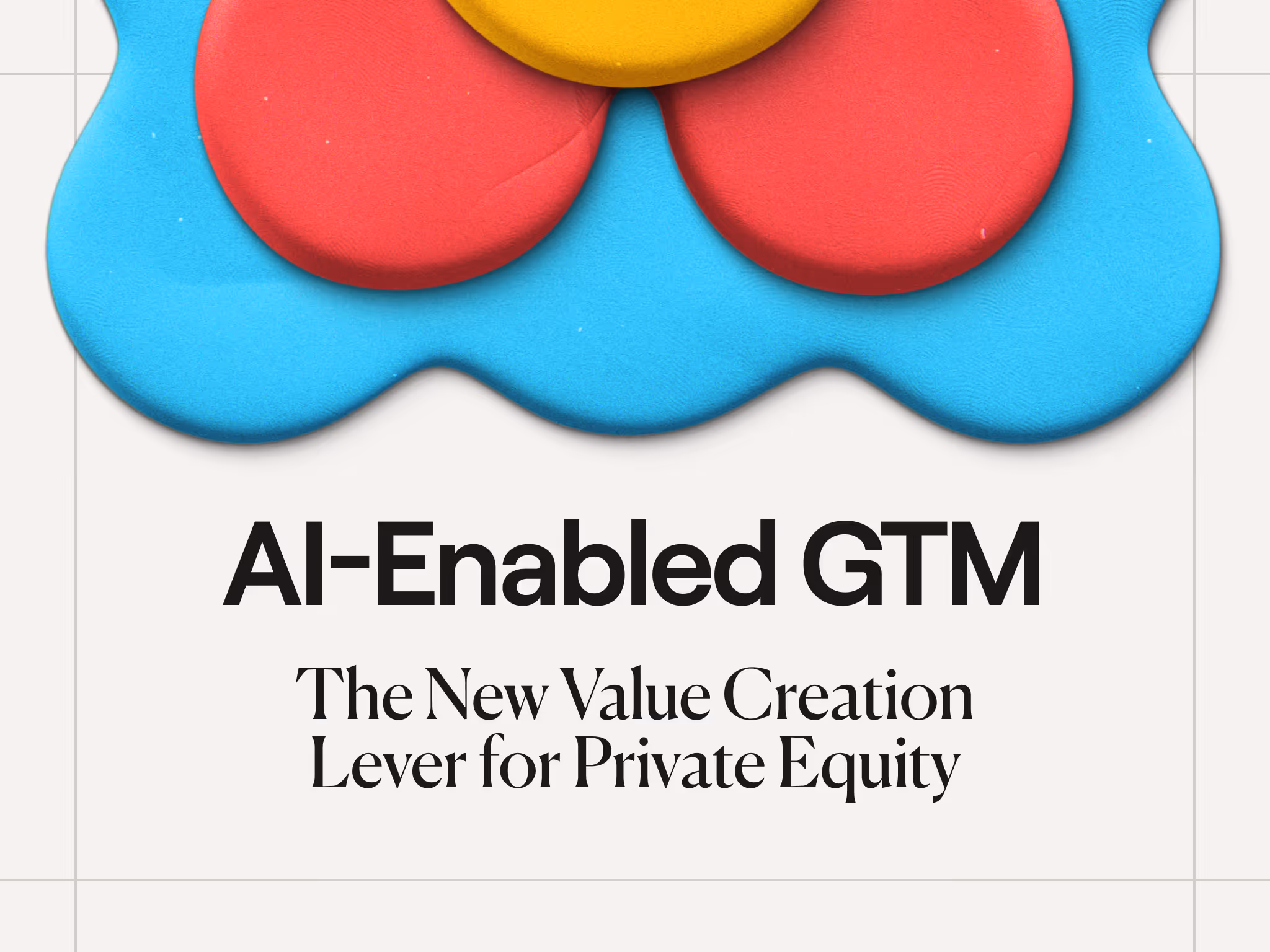
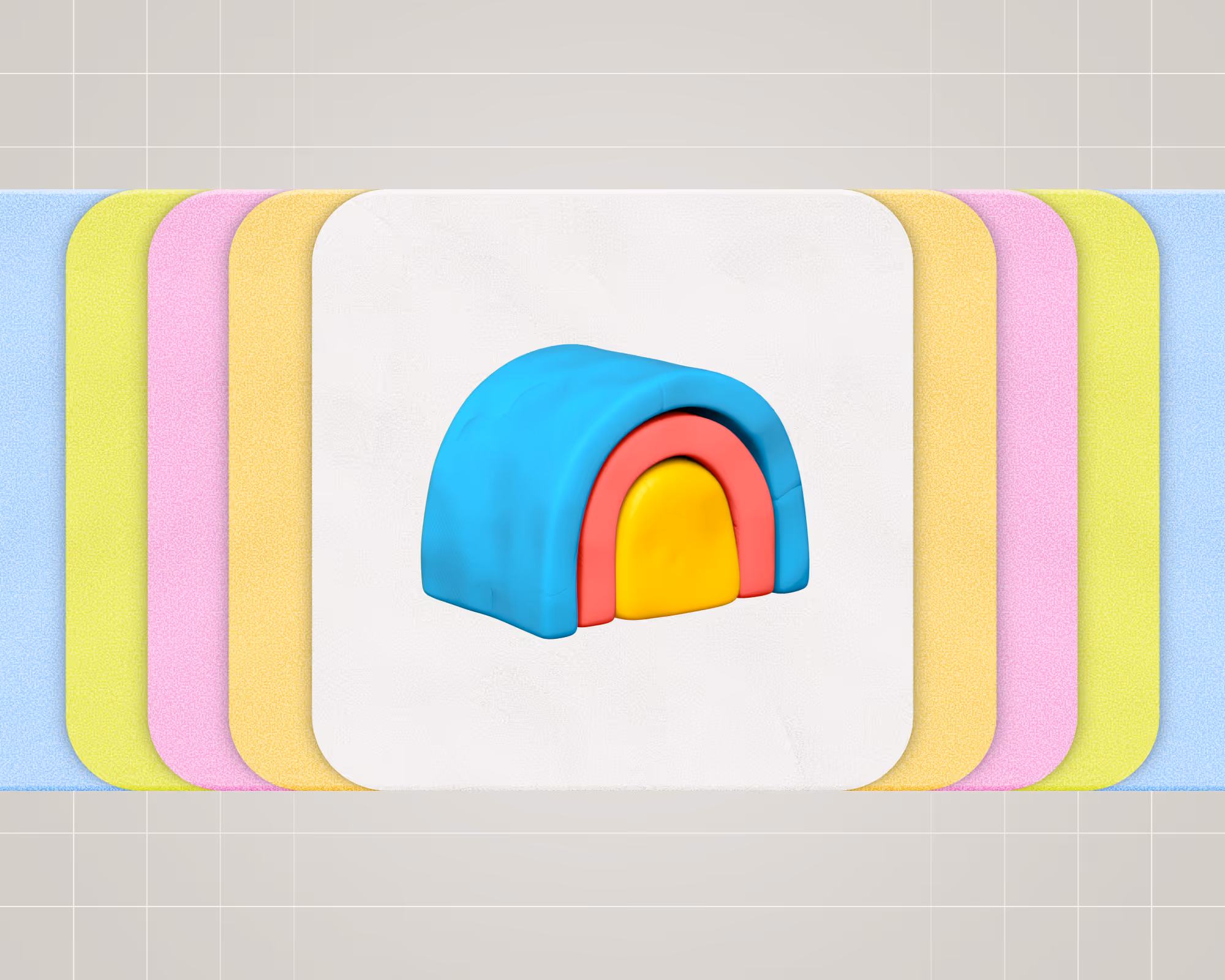
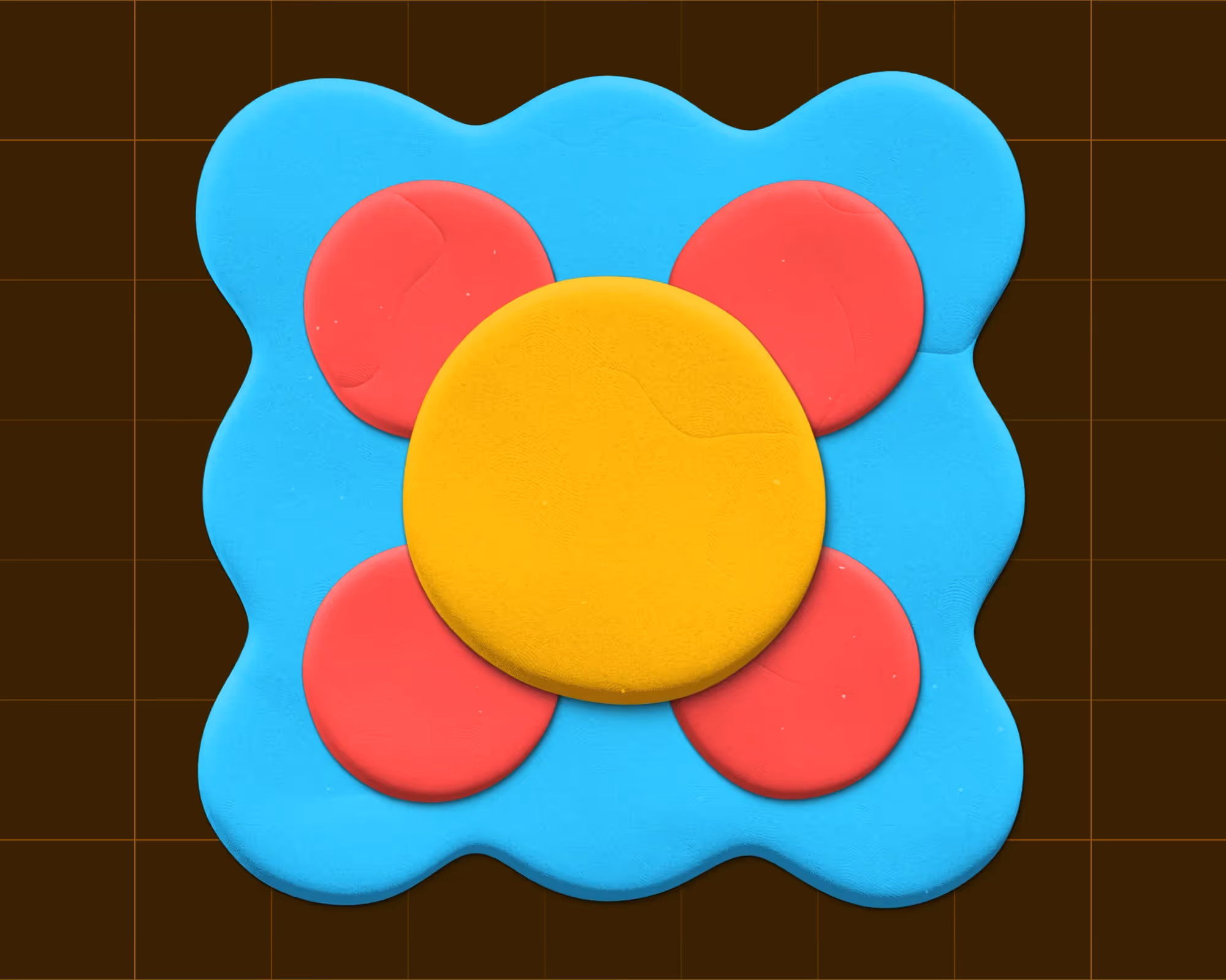
We hand-sculpted clay forms and used those organic shapes throughout the event’s branding and environment. They became vibrant backdrops on stage, vessels for content on screens and signage, and dynamic art pieces scattered across the venue. The effect was a visual world that felt hand-crafted and alive.
Even the smallest details displayed a human touch. Floor maps, name badges, and speaker headshots were stylized to appear hand-molded. This gave everything a sense of care and individuality, underlining our analog theme.
Many of the clay forms were animated or interactive, blending the digital mind into our analog visuals. On large LED displays, we showed abstract clay shapes that assembled and disassembled in real-time, mirroring the iterative process of creation. Signage was another playful touchpoint: Wayfinding graphics wrapped around corners and columns like coils of clay. The stage design featured sculptural shapes that not only decorated the space but also served as projection surfaces for dynamic lighting and content, so the environment evolved throughout the day.
By marrying physical clay art with digital motion design, we reinforced the conference’s theme in every frame: that this was a living design system attendees could (literally) move through and watch change.
1. From idea to form
The earliest sketches of Sculpt were just that — sketches. Circles, coils, and loops that were clearly created by humans.
Our product lives in pixels, yet our customers think like artists — iterating, shaping, refining, and evolving their craft over time. After several rounds of ideation, we decided the identity had to be fluid. We wanted Sculpt to feel like a studio in motion — alive with unfinished ideas and imperfect beauty. The analog/digital tension became our north star:
If Clay represents the mind, Sculpt represents the hands.
2. The design
We established a few principles early that guided every decision, from the shape of the stage to the function of the attendee badges.
- Tactility over polish.
Every surface needed to feel touchable. Even our screens looked sculpted. - Participation over observation.
Attendees wouldn’t just watch. They’d shape, write, and build alongside us. - Imperfection as beauty.
Organic curves, asymmetry, fingerprints - these weren’t flaws, but features. - Blending worlds.
Each moment was a dialogue between analog and digital - between clay and code.
These weren’t aesthetic choices alone. They were our design ethics — a way to make the event feel like Clay without ever saying it out loud.
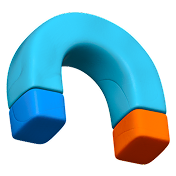
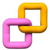
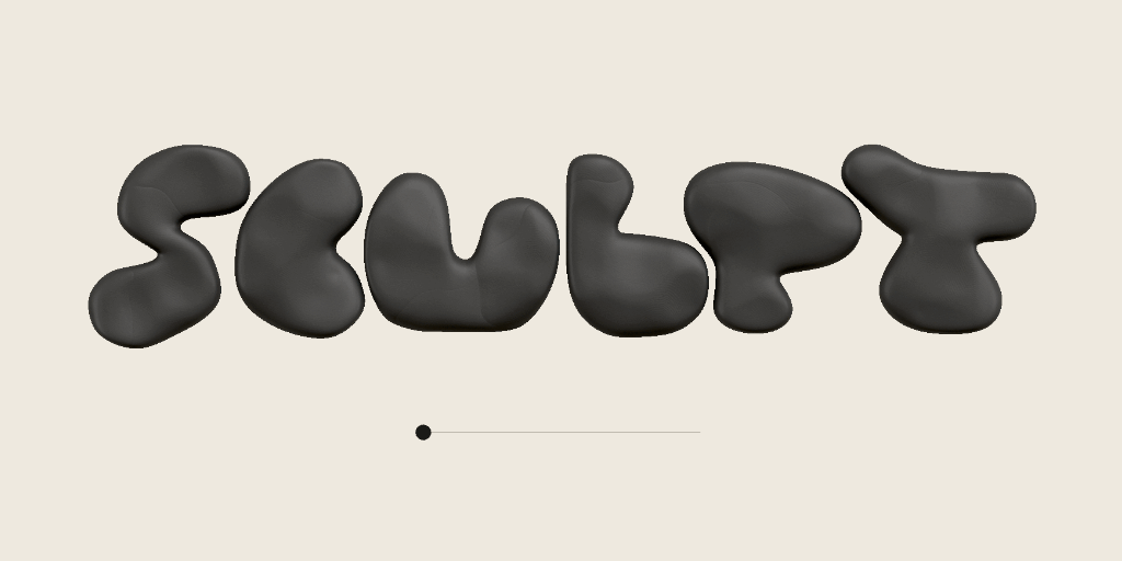
As mentioned above, we started with physical clay, molding by hand into organic shapes. We then brought them into Figma and Blender, where we established a formula for creating these organic shapes in the digital world that would stretch across nearly every touchpoint at the event. Although it may have saved time, we resisted the urge to generate these with AI, knowing that the soul of the idea would be lost. We lovingly referred to these handmade shapes as blobs.
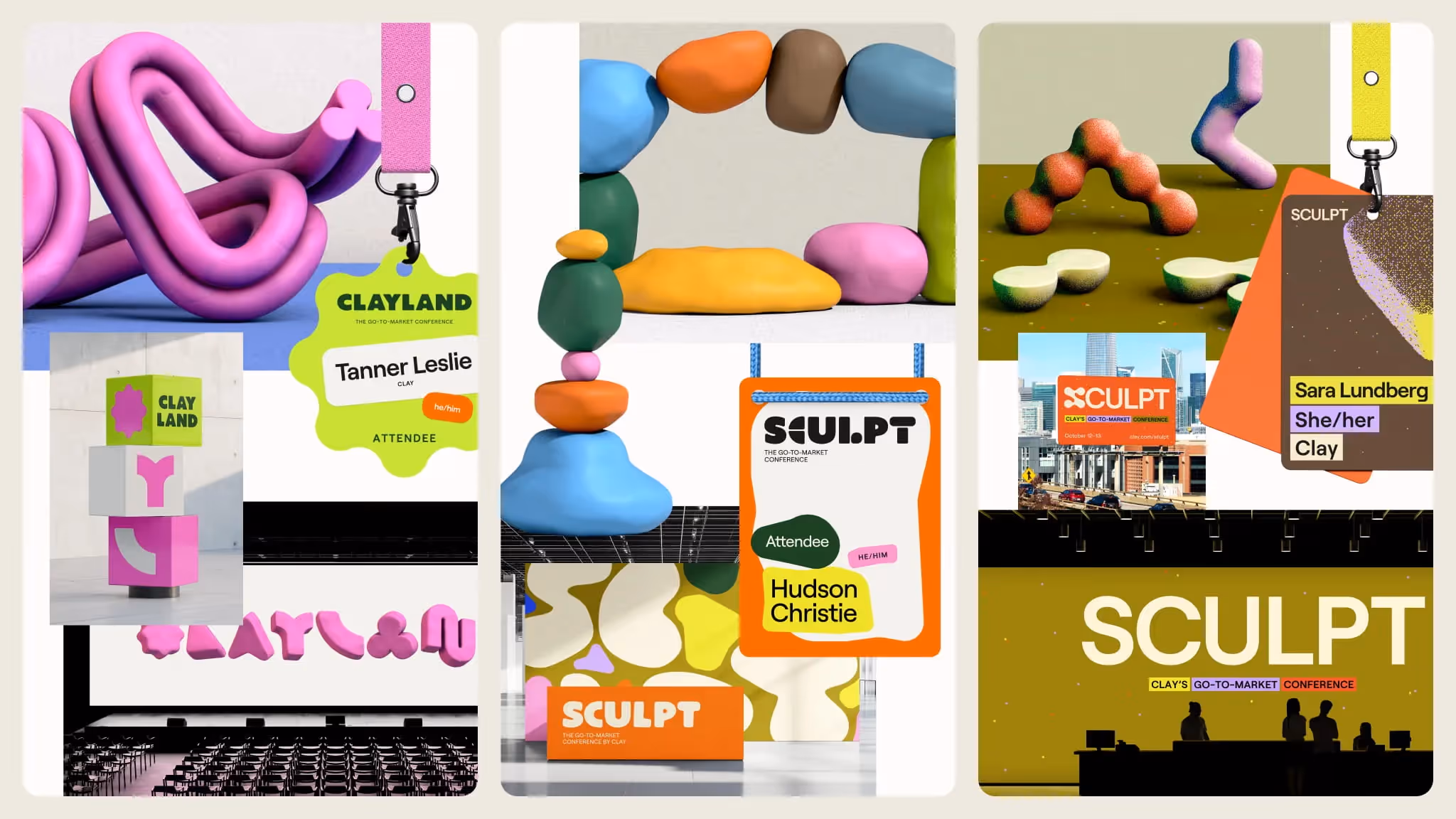
With the help of Hudson Christie, our in-house illustrator and 3D artist, the logo for the conference became something totally organic and unique, which could shape-shift between a more legible wordmark and a “squished” version, mimicking the physicality of clay.
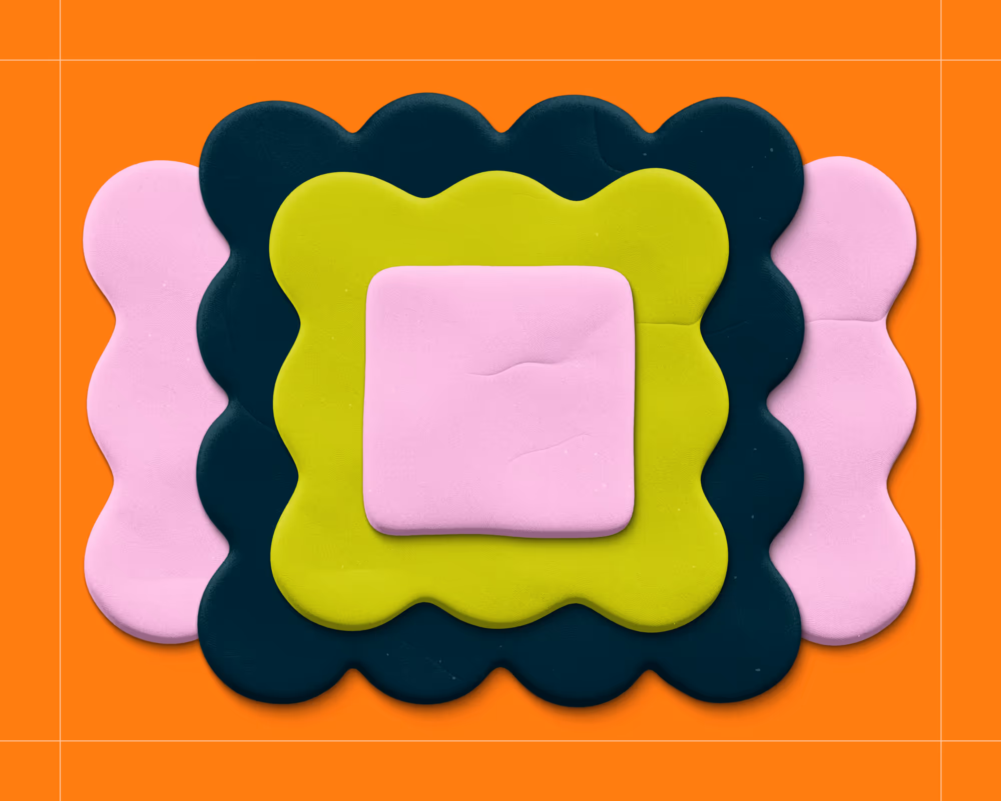
To bring these shapes and environments to life, we departed from Clay’s core color palette and introduced a fresh, but limited, new set of colors that blended earthy clay-like tones with bright, glowing digital hues.
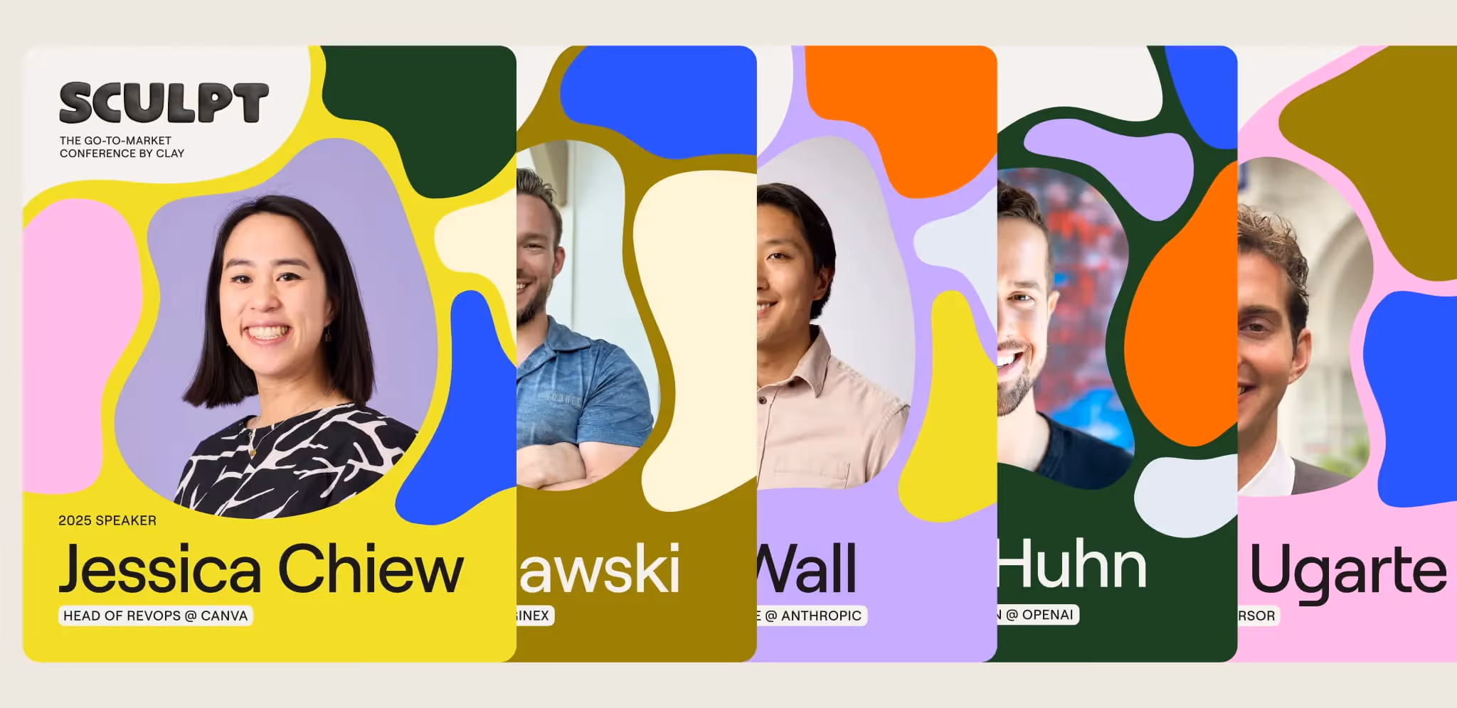
We designed and built a conference site that broke traditional web design rules. Sections had organic edges, buttons were not rectangles, headshots were masked inside our blob shapes, and color played a major, expressive role.
Across our marketing materials, blobs became containers for copy and imagery, rather than simply decoration or pattern. Because these shapes were drawn to fit their content, each asset was unique while clearly fitting into a recognizable system.
We knew from the beginning that this visual language would really shine when brought to life with motion, so we worked with the talented Stasiya Bulavkina to create a motion style that made Sculpt feel alive. She not only created custom animations for our suite of promotional content, but also the full slate of graphics for the venue screens, stage loops, speaker intros, and keynote announcements.
3. Clay × Trademark Event Productions
The Trademark team were our production partners and creative co-sculptors.
They understood the paradox immediately: you want a space that feels hand-made but runs like a Swiss watch.
Together, we translated abstract moodboards into buildable forms, empty rooms into buzzing spaces of creativity. The back-and-forth was fluid — our design team playing with form and concept, while Trademark grounded them in structure and light. Their experience brought scale and realism to our clay-inspired ideas: filling spaces with sculptural forms, aligning motion graphics perfectly with uneven surfaces, and figuring out how to let 500 people literally play with clay without turning the venue into a mess.
Not only did Trademark translate our ideas, they also expanded upon them. They found endless activation opportunities that extended our theme, like clay coiling workshops—led by Danielle Bentz in partnership with &Open, helped us build a sponsor space that felt more like a listening lounge than a convention, and collaborated with our caterers to infuse the identity’s colors and shapes into the food and plating.
Like any good creative process, there were also moments of friction. Digital renderings that looked ethereal but defied gravity, stage pieces that looked like ancient vessels but needed fireproofing — and those frictions birthed invention. One of our favorite examples of this came when we craved a wider, more integrated stage. They raised the practical concern of egress and fire safety, but told us they’d think on it and get back to us. A few days later, they had reimagined our stage scenic designs to extend edge-to-edge, but with an invisible door built in.
In the end, the result was creative harmony. Us and them, molding the same vision.
4. Designing for the guest journey
With intention, every touchpoint became part of the greater sculpture.
Arrival:
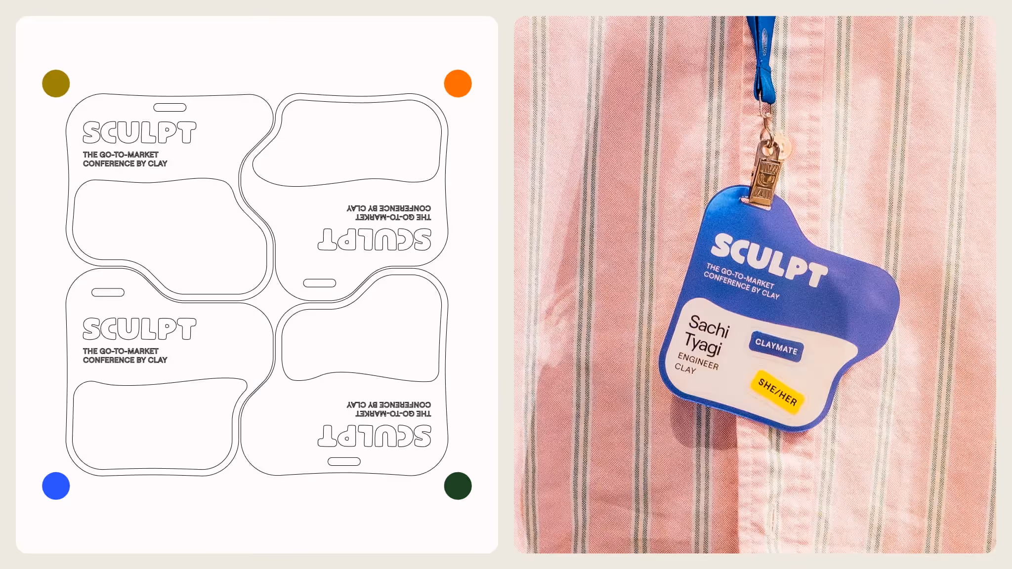
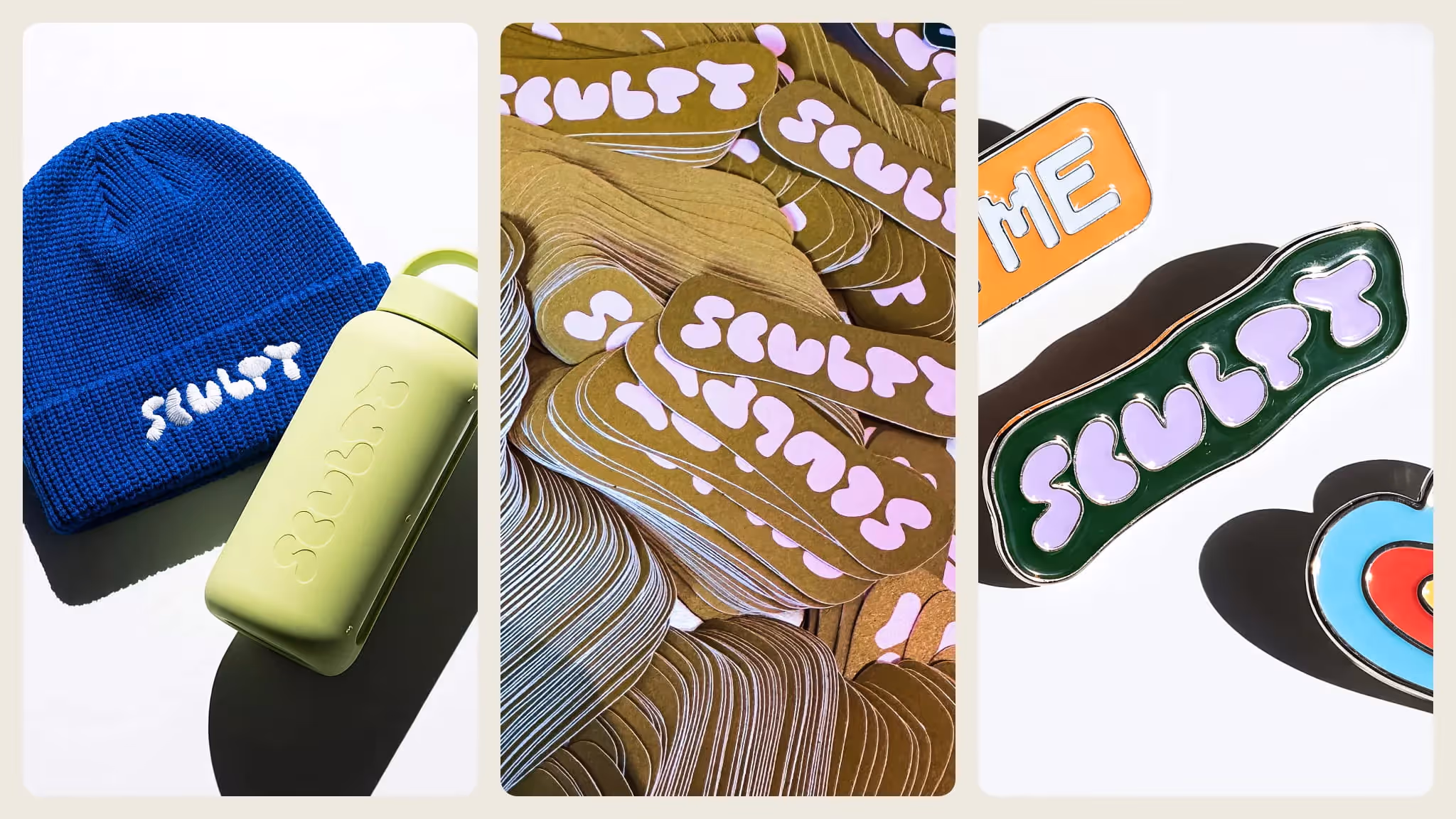
Guests were met with coffee, then retrieved their totes and badges. Instead of rectangular attendee badges, we designed custom sets of 4 unique die-cut badges, each in its own color. Guests would eventually find that their badge interlocked with three other badges like a puzzle, and that by tracking down their missing puzzle pieces, they’d meet new friends and earn a reward.
Main stage:
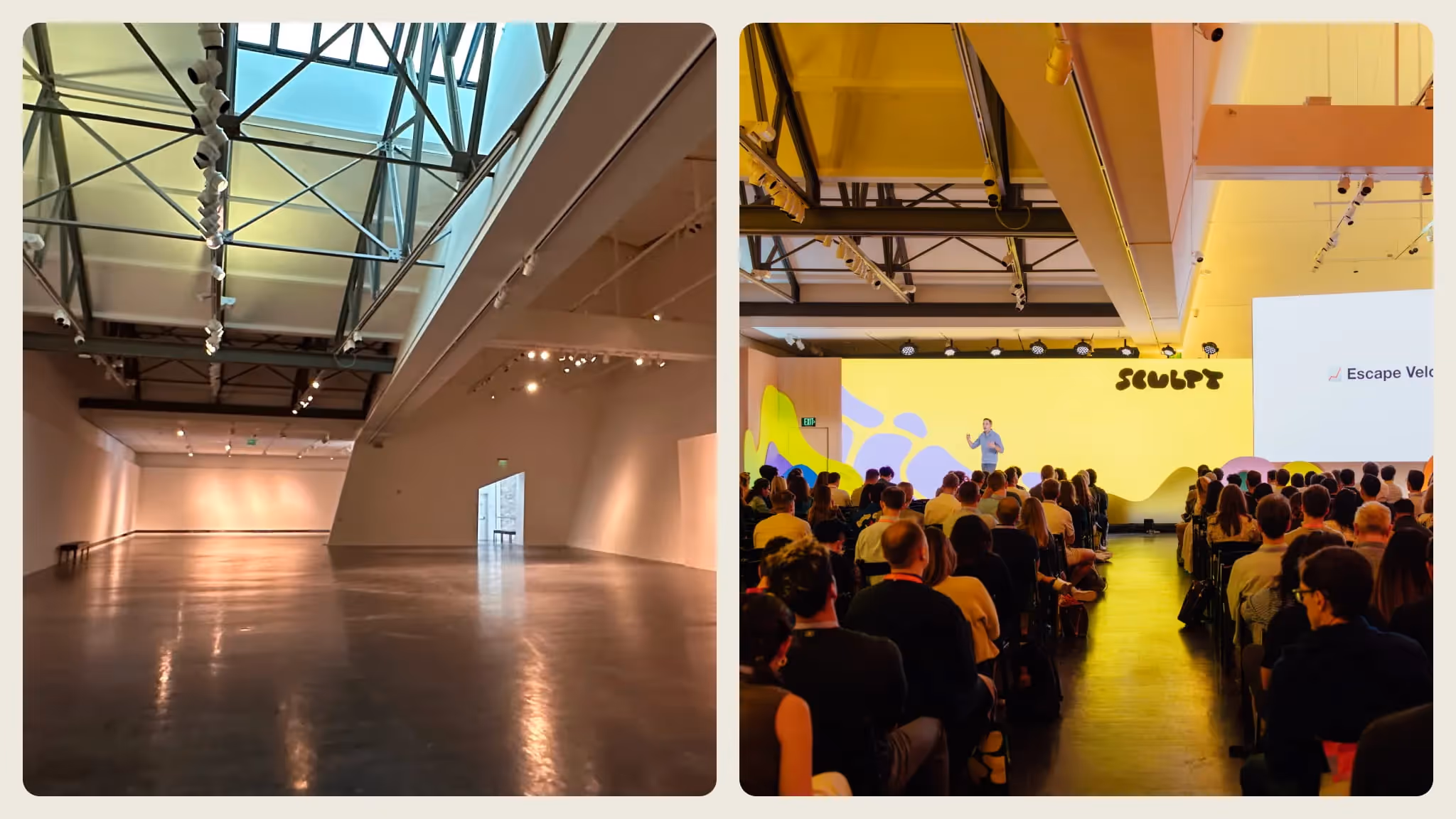
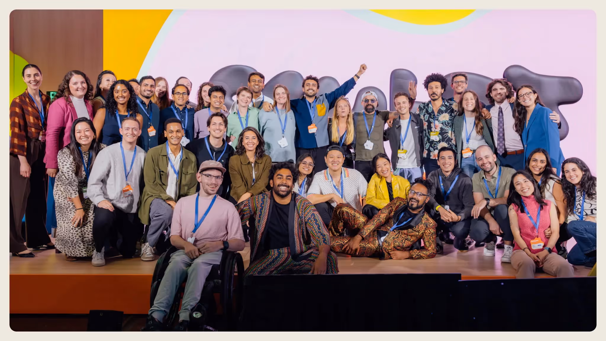
Trademark surprised us with custom lighting gobos that brought our blobs to life in the form of projection. Our color palette was translated into light, filling the space with energizing hues that drew the eye toward the front: the aforementioned expansive stage, nestled into physical blobs as if it had been sculpted into place.
Third spaces:
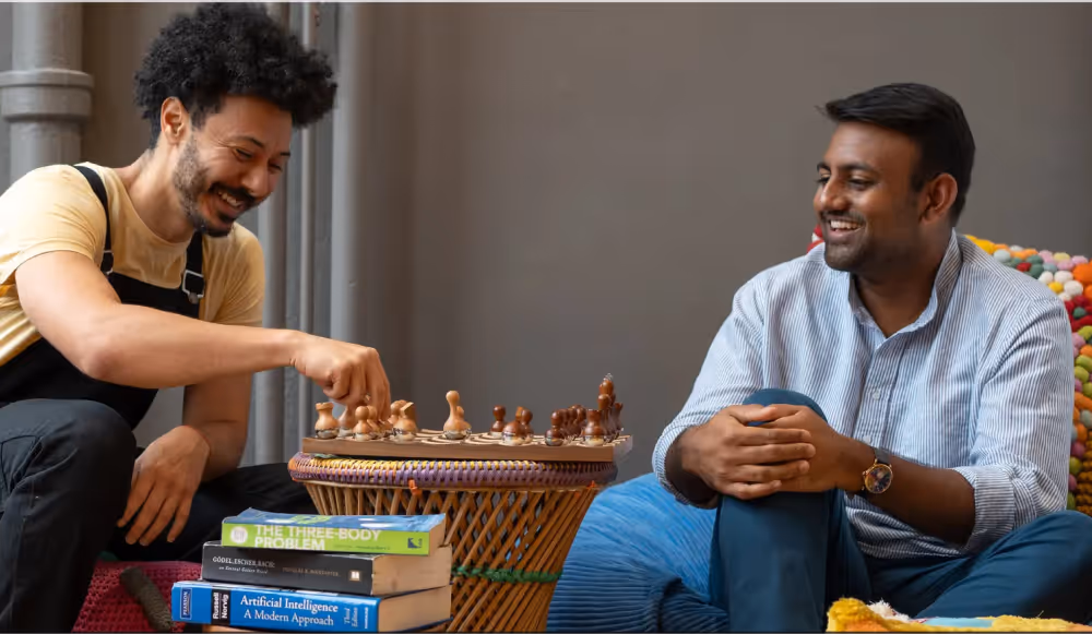
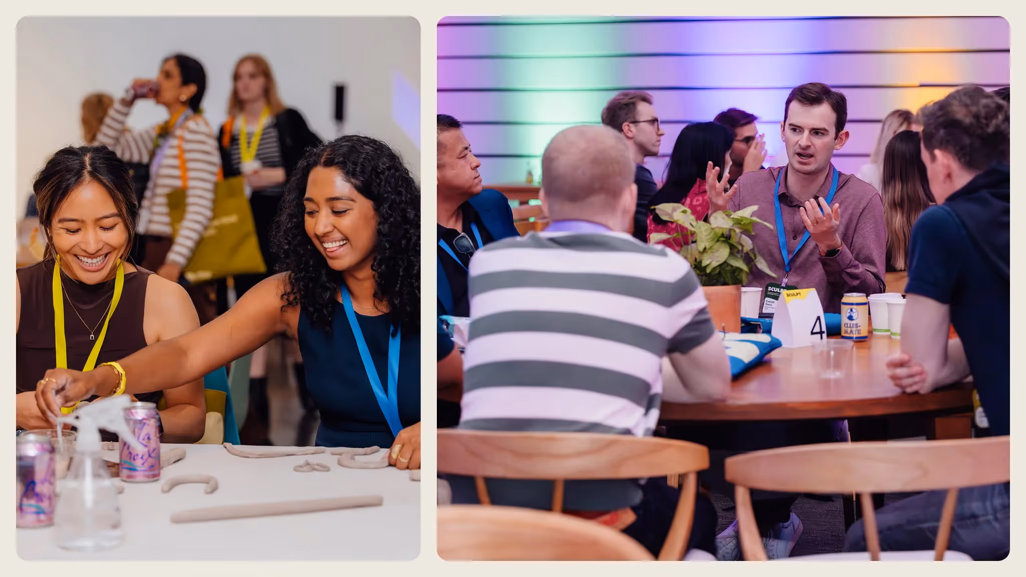
Breakout rooms and lounges were filled with collaborative tables where attendees shaped clay, chatted, or learned more about the Clay product in an open and creative environment.
Workshops:
Clay employees and partners led engaging sessions where people actually built in Clay, taking home tactile knowledge that they could use on Monday.
Swag & merch:
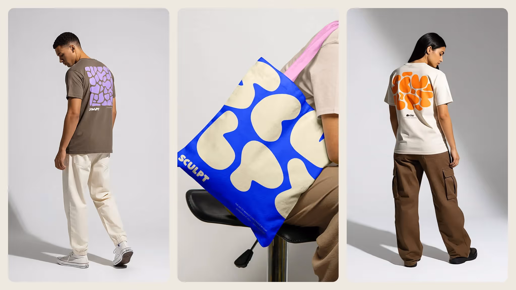
Each attendee received a custom-dyed, sustainably sourced tote in one of 4 color combinations, made by hand by our partner Work+Shelter, a production center in Delhi, India that empowers women through fair wages and safe working conditions.
We also designed a limited collection of conference merch, working directly with our independent vendor in Brooklyn, Padlock Embroidery, to embroider, screen print, and customize each piece.
One of our favorite activations was the communal clay-coiling sculpture. Guests would add a coil, a line, or a carving to make their unique mark. By the end of the day, it stood as a collective artifact: proof that hundreds of individual gestures could come together into one living form.
5. A little bit of magic
We ended the day not with a celebrity speaker to entice otherwise bored attendees to stay, but with a magician.
Magic is a practice closely tied to Clay’s culture - it’s even reflected in our brand pillars. At the end of the conference, attendees filled our main stage to witness something unexpectedly fun and completely extracurricular.
By the end of the show, the energy had transformed. People moved more slowly, chatted more freely, and lingered at happy hour until it closed.
Guests described it as “an event that felt alive,” “the most human tech gathering,” “like walking through a design system made of earth.”
For us, that was the win: when design disappears into experience, what’s left is a feeling.
What we learned
Sculpt taught us that large-scale experiences can be intimate and warm if designed with care. That in our digital, automated world, humans crave the real, the handmade, and the imperfect more than ever.
We also learned that playfulness still has a place in every environment. By challenging ourselves to think outside the corporate event box and taking the risk to stretch ourselves beyond the mold, we uncovered what some thought was lost: that creativity still begets the best outcomes, no matter what industry you’re in.
Finally, we learned that great production partners don’t just execute — they translate dreams into structure. And that design, at its best, isn’t just what people see, it’s what they sense, carry home, and remember until the next time.
Closing thought
If Clay is a tool for shaping ideas, Sculpt is where those ideas take human form.
We left with more fingerprints than we started with — and that’s exactly the point.
Sculpt isn’t just a theme. It’s a practice.
Crafting the concept: analog soul meets digital mind
The concept for Sculpt emerged from a simple idea: although Clay (the company) builds digital tools, its spirit is deeply analog. We wanted the event to feel like the meeting point of these two worlds.
The name Sculpt became our metaphor – a space where people shape ideas in real time, much like potters shaping clay. We envisioned the conference as a “communal kiln” where the process of creation is just as important as the final product. This meant embracing an ethos of hands-on making, experimentation, and a touch of messiness. Rather than a polished, rigid corporate event, Sculpt would be about process as much as product: it’s hands-on, messy, iterative, and full of unexpected breakthroughs. A celebration of imperfection and the craft of making something real.
We wanted to break the passive conference mold. Sculpt was designed to be interactive and involved, where attendees wouldn’t just sit and listen to slide decks, they would actively participate. The official announcement communicated this precedent: “You won’t be sitting silently in a crowd… You’ll build AI workflows… and get your hands on new features”.
This mandate for interactivity flowed directly from our analog-meets-digital concept. Just as working with clay requires tactility and involvement, so would our conference. We set out to create an environment where every guest felt like a co-creator rather than an observer.
Bringing Clay’s aesthetic to life
To communicate the analog spirit, we turned to clay, the material, as our primary design language. The visual identity of Sculpt was tactile, earthy, and full of character.
We hand-sculpted clay forms and used those organic shapes throughout the event’s branding and environment. They became vibrant backdrops on stage, vessels for content on screens and signage, and dynamic art pieces scattered across the venue. The effect was a visual world that felt hand-crafted and alive.
Even the smallest details displayed a human touch. Floor maps, name badges, and speaker headshots were stylized to appear hand-molded. This gave everything a sense of care and individuality, underlining our analog theme.
Many of the clay forms were animated or interactive, blending the digital mind into our analog visuals. On large LED displays, we showed abstract clay shapes that assembled and disassembled in real-time, mirroring the iterative process of creation. Signage was another playful touchpoint: Wayfinding graphics wrapped around corners and columns like coils of clay. The stage design featured sculptural shapes that not only decorated the space but also served as projection surfaces for dynamic lighting and content, so the environment evolved throughout the day.
By marrying physical clay art with digital motion design, we reinforced the conference’s theme in every frame: that this was a living design system attendees could (literally) move through and watch change.
1. From idea to form
The earliest sketches of Sculpt were just that — sketches. Circles, coils, and loops that were clearly created by humans.
Our product lives in pixels, yet our customers think like artists — iterating, shaping, refining, and evolving their craft over time. After several rounds of ideation, we decided the identity had to be fluid. We wanted Sculpt to feel like a studio in motion — alive with unfinished ideas and imperfect beauty. The analog/digital tension became our north star:
If Clay represents the mind, Sculpt represents the hands.
2. The design
We established a few principles early that guided every decision, from the shape of the stage to the function of the attendee badges.
- Tactility over polish.
Every surface needed to feel touchable. Even our screens looked sculpted. - Participation over observation.
Attendees wouldn’t just watch. They’d shape, write, and build alongside us. - Imperfection as beauty.
Organic curves, asymmetry, fingerprints - these weren’t flaws, but features. - Blending worlds.
Each moment was a dialogue between analog and digital - between clay and code.
These weren’t aesthetic choices alone. They were our design ethics — a way to make the event feel like Clay without ever saying it out loud.
As mentioned above, we started with physical clay, molding by hand into organic shapes. We then brought them into Figma and Blender, where we established a formula for creating these organic shapes in the digital world that would stretch across nearly every touchpoint at the event. Although it may have saved time, we resisted the urge to generate these with AI, knowing that the soul of the idea would be lost. We lovingly referred to these handmade shapes as blobs.
With the help of Hudson Christie, our in-house illustrator and 3D artist, the logo for the conference became something totally organic and unique, which could shape-shift between a more legible wordmark and a “squished” version, mimicking the physicality of clay.
To bring these shapes and environments to life, we departed from Clay’s core color palette and introduced a fresh, but limited, new set of colors that blended earthy clay-like tones with bright, glowing digital hues.
We designed and built a conference site that broke traditional web design rules. Sections had organic edges, buttons were not rectangles, headshots were masked inside our blob shapes, and color played a major, expressive role.
Across our marketing materials, blobs became containers for copy and imagery, rather than simply decoration or pattern. Because these shapes were drawn to fit their content, each asset was unique while clearly fitting into a recognizable system.
We knew from the beginning that this visual language would really shine when brought to life with motion, so we worked with the talented Stasiya Bulavkina to create a motion style that made Sculpt feel alive. She not only created custom animations for our suite of promotional content, but also the full slate of graphics for the venue screens, stage loops, speaker intros, and keynote announcements.
3. Clay × Trademark Event Productions
The Trademark team were our production partners and creative co-sculptors.
They understood the paradox immediately: you want a space that feels hand-made but runs like a Swiss watch.
Together, we translated abstract moodboards into buildable forms, empty rooms into buzzing spaces of creativity. The back-and-forth was fluid — our design team playing with form and concept, while Trademark grounded them in structure and light. Their experience brought scale and realism to our clay-inspired ideas: filling spaces with sculptural forms, aligning motion graphics perfectly with uneven surfaces, and figuring out how to let 500 people literally play with clay without turning the venue into a mess.
Not only did Trademark translate our ideas, they also expanded upon them. They found endless activation opportunities that extended our theme, like clay coiling workshops—led by Danielle Bentz in partnership with &Open, helped us build a sponsor space that felt more like a listening lounge than a convention, and collaborated with our caterers to infuse the identity’s colors and shapes into the food and plating.
Like any good creative process, there were also moments of friction. Digital renderings that looked ethereal but defied gravity, stage pieces that looked like ancient vessels but needed fireproofing — and those frictions birthed invention. One of our favorite examples of this came when we craved a wider, more integrated stage. They raised the practical concern of egress and fire safety, but told us they’d think on it and get back to us. A few days later, they had reimagined our stage scenic designs to extend edge-to-edge, but with an invisible door built in.
In the end, the result was creative harmony. Us and them, molding the same vision.
4. Designing for the guest journey
With intention, every touchpoint became part of the greater sculpture.
Arrival:
Guests were met with coffee, then retrieved their totes and badges. Instead of rectangular attendee badges, we designed custom sets of 4 unique die-cut badges, each in its own color. Guests would eventually find that their badge interlocked with three other badges like a puzzle, and that by tracking down their missing puzzle pieces, they’d meet new friends and earn a reward.
Main stage:
Trademark surprised us with custom lighting gobos that brought our blobs to life in the form of projection. Our color palette was translated into light, filling the space with energizing hues that drew the eye toward the front: the aforementioned expansive stage, nestled into physical blobs as if it had been sculpted into place.
Third spaces:
Breakout rooms and lounges were filled with collaborative tables where attendees shaped clay, chatted, or learned more about the Clay product in an open and creative environment.
Workshops:
Clay employees and partners led engaging sessions where people actually built in Clay, taking home tactile knowledge that they could use on Monday.
Swag & merch:
Each attendee received a custom-dyed, sustainably sourced tote in one of 4 color combinations, made by hand by our partner Work+Shelter, a production center in Delhi, India that empowers women through fair wages and safe working conditions.
We also designed a limited collection of conference merch, working directly with our independent vendor in Brooklyn, Padlock Embroidery, to embroider, screen print, and customize each piece.
One of our favorite activations was the communal clay-coiling sculpture. Guests would add a coil, a line, or a carving to make their unique mark. By the end of the day, it stood as a collective artifact: proof that hundreds of individual gestures could come together into one living form.
5. A little bit of magic
We ended the day not with a celebrity speaker to entice otherwise bored attendees to stay, but with a magician.
Magic is a practice closely tied to Clay’s culture - it’s even reflected in our brand pillars. At the end of the conference, attendees filled our main stage to witness something unexpectedly fun and completely extracurricular.
By the end of the show, the energy had transformed. People moved more slowly, chatted more freely, and lingered at happy hour until it closed.
Guests described it as “an event that felt alive,” “the most human tech gathering,” “like walking through a design system made of earth.”
For us, that was the win: when design disappears into experience, what’s left is a feeling.
What we learned
Sculpt taught us that large-scale experiences can be intimate and warm if designed with care. That in our digital, automated world, humans crave the real, the handmade, and the imperfect more than ever.
We also learned that playfulness still has a place in every environment. By challenging ourselves to think outside the corporate event box and taking the risk to stretch ourselves beyond the mold, we uncovered what some thought was lost: that creativity still begets the best outcomes, no matter what industry you’re in.
Finally, we learned that great production partners don’t just execute — they translate dreams into structure. And that design, at its best, isn’t just what people see, it’s what they sense, carry home, and remember until the next time.
Closing thought
If Clay is a tool for shaping ideas, Sculpt is where those ideas take human form.
We left with more fingerprints than we started with — and that’s exactly the point.
Sculpt isn’t just a theme. It’s a practice.
.avif)


.avif)


.avif)


.avif)

.avif)